
Robert Green explains why he has revisited his Doves Type and produced new Text & Headline versions of the iconic typeface.
Since its initial release in 2013, there have been two further updates of the digital Doves Type. This latest version was developed over the last two years. There were several reasons for revisiting the typeface.
Since I began the project in 2010, I have collected a wide range of Doves Press publications and other materials such as ‘overs’ sheets and proofs, in addition to the metal type I salvaged in 2014. Each new example highlighted another aspect of the typeface I hadn’t noticed or considered before. Eventually, I decided my font needed to be redrawn entirely.
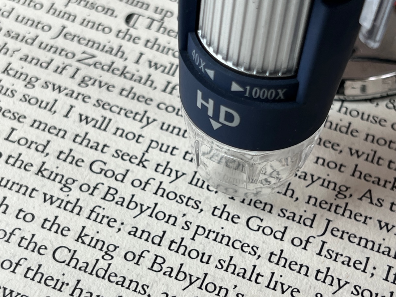
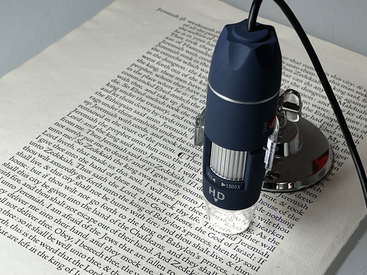
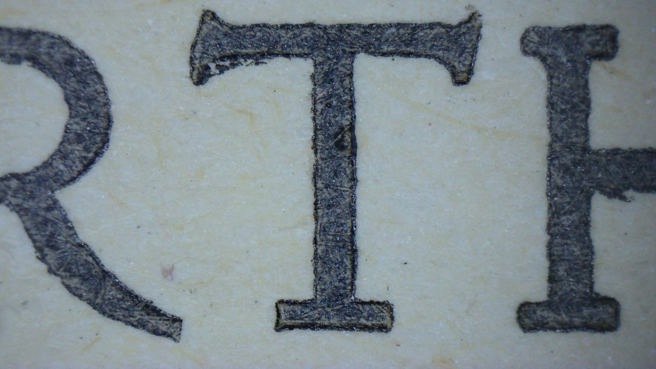
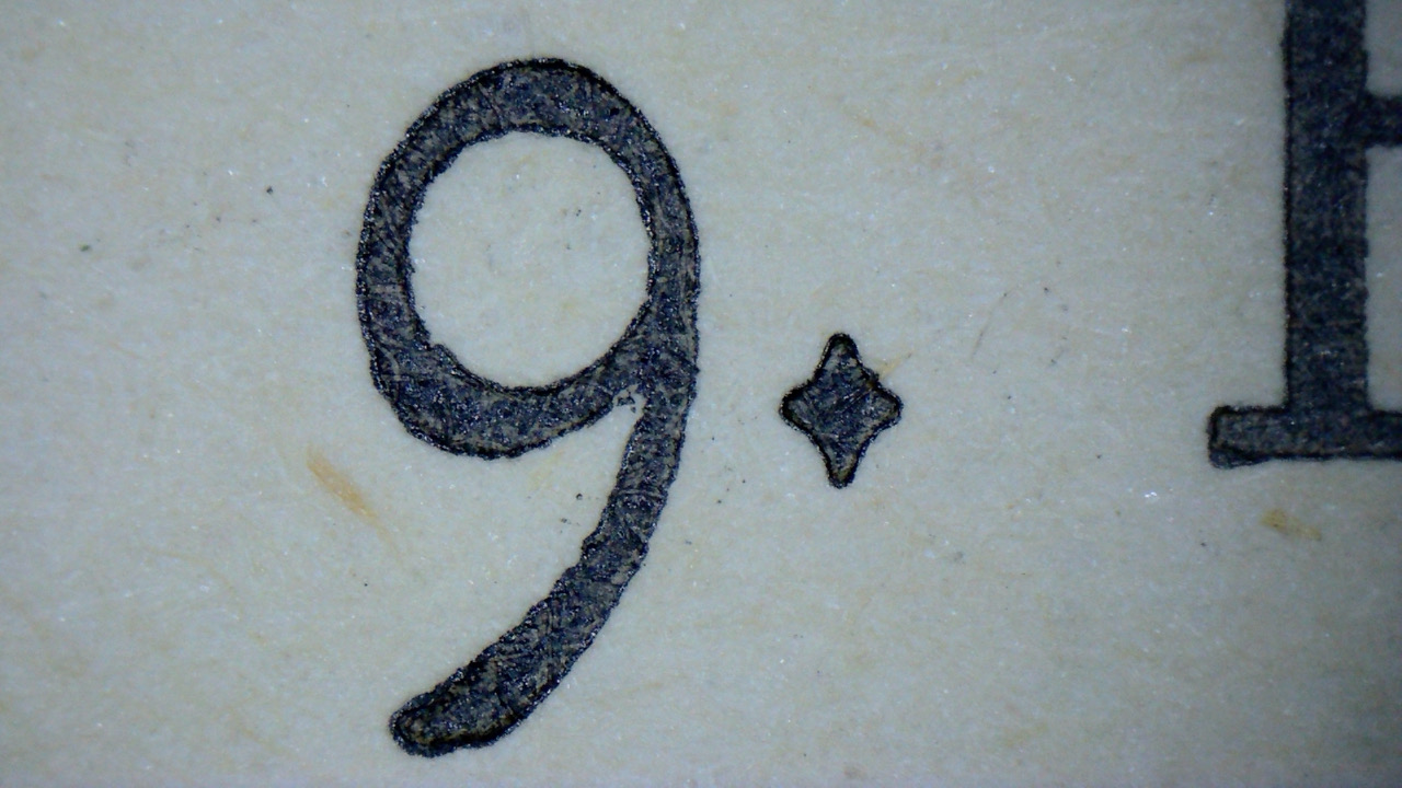
My imaging methods for recording sources have also changed. To begin with, I worked only from hi-res scans, which I still use to capture large portions of text for kerning and spacing references. However, due to a lack of control over focus and the high contrast of scanned images, it is not the best method for analysing individual glyphs. Far better than scanning is macro photography, which I incorporated when I updated the font in 2014. Again, this still has its place, but recently I’ve been using a digital microscope camera. The technology does have some drawbacks: a small lens means its limited image field can accommodate only a few characters at a time, and there is a slight degree of distortion around the edges of the frame. Nevertheless, the images it produces capture incredible detail and are the most revealing for studying individual letterforms.
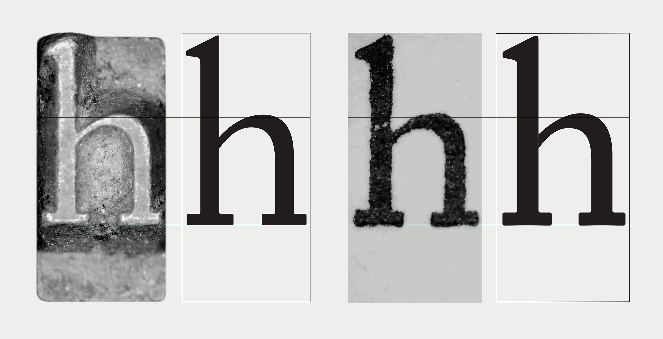
The principles of reviving a typeface haven’t changed much since 1899, when T. J. Cobden-Sanderson and Emery Walker set about creating a modern version of fifteenth-century printer Nicolas Jenson’s type. Walker later said that the sources he chose to enlarge as models for the Doves Roman were ‘judging by modern standards over-inked and gave an imperfect view of the type. The true shapes had to be extracted so to speak.’
Despite Cobden-Sanderson putting endless hours into weeding out printed impressions that did not meet his exacting standards, enlarged images of Doves’ presswork will also give ‘an imperfect view of the type’. No matter how sharp it appears to the naked eye, a close look at any impression will reveal some ‘ink squash’ — pressure from the printing press squeezing ink out from the typeface, leaving letterforms with shaggy or bumpy outlines. But when the type is magnified it is often also possible to see a halo of thin grey ink sandwiched between this outline and the ink filling the letterform. The effect can serve as a guide to the type’s ‘true shapes’, and the microscope captures it with more clarity than other methods. (See images.)
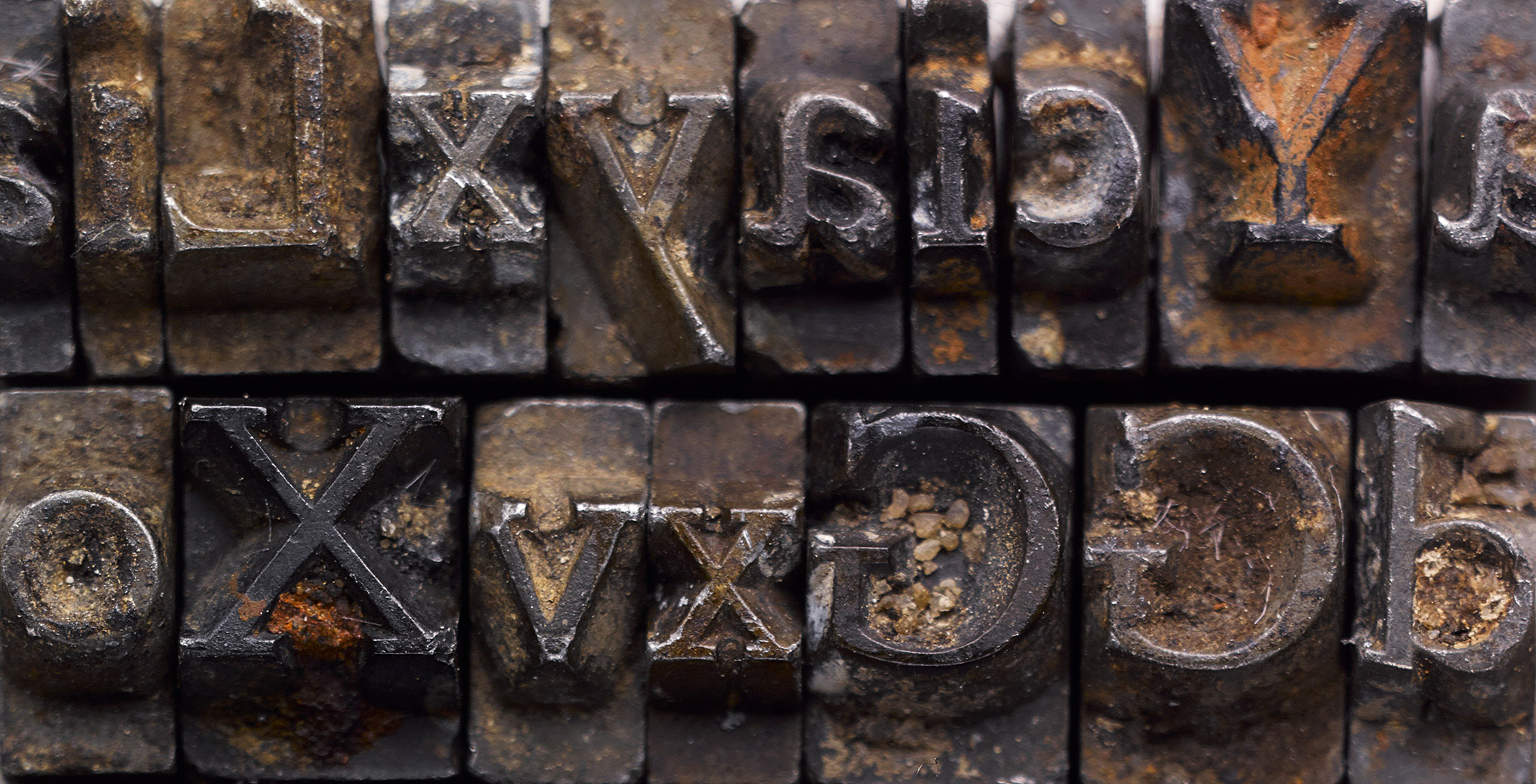
The metal sorts were also used as sources for outlines and were drawn separately, then cross-referenced with drawings derived from the printed type. By the end of 2021, I effectively had beta versions of two entirely new fonts. Both versions of the new Doves Type have been released as Doves Text and Doves Headline. The fonts differ slightly in weight and rendering, and each has a specific purpose.
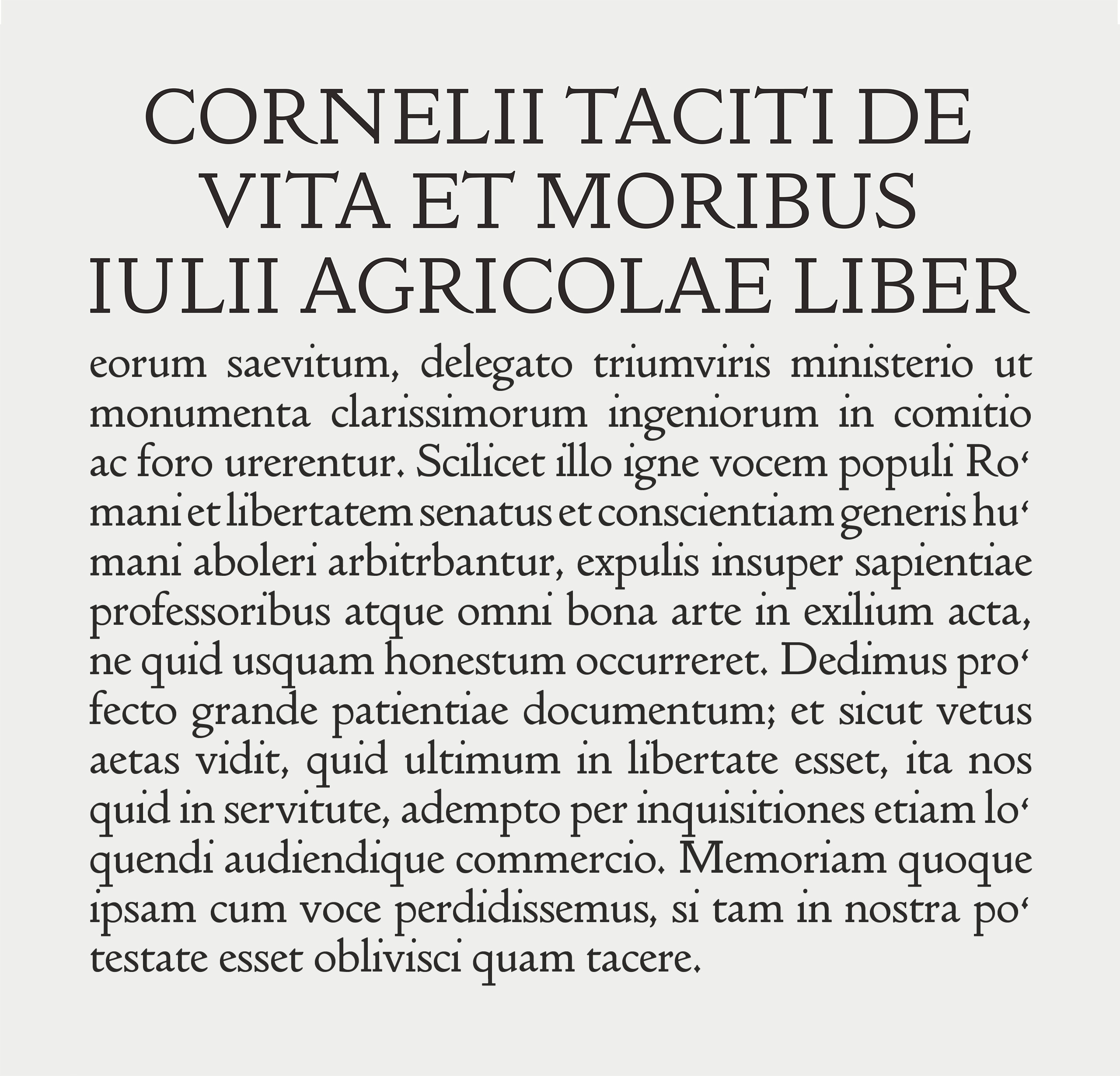
The heavier Doves Text was designed for setting copy at sizes below 20 pt. It is similar to previous iterations of the Doves Type: stem and stroke weights remain the same, comparable to a book cut, but the updated version is intended to be an improvement for print and onscreen applications. It’s still an attempt to recreate the soft ink spread of letterpress, but I’ve eliminated some of the irregularities that were present in the last version.
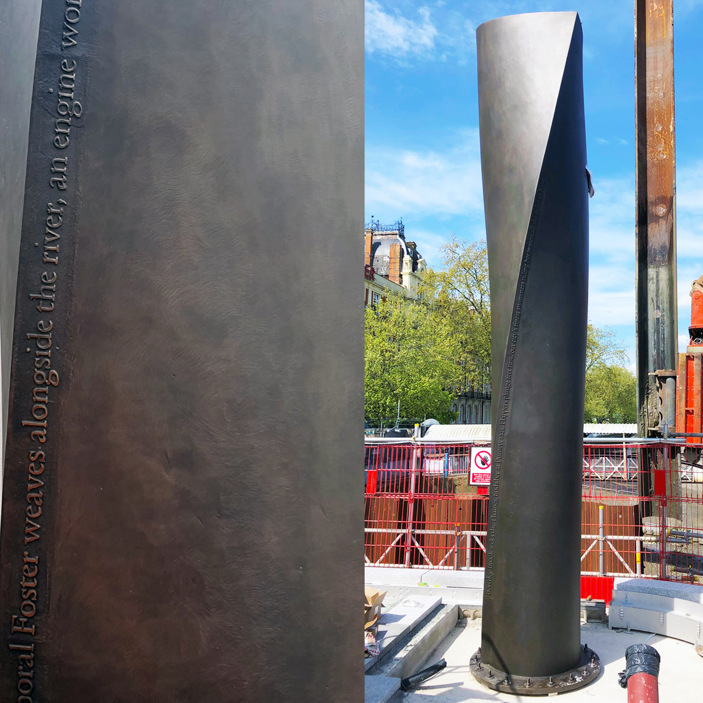
Doves Headline was designed for larger applications such as titles, headings, and sub-headings. The need for a secondary font became apparent as practical and formal considerations arose during recent work on the new Thames Tideway scheme, due for completion in 2024. The Doves Type was commissioned as Tideway’s font for lettering applied to architectural objects such as walls, railings, paving, and a series of ventilation columns. Lettering is being fabricated in brick, granite, brass, wrought iron, and steel. Firstly, a facsimile font derived from letterpress outlines was not appropriate for these applications, as it was rendered to represent print rather than architectural letter cutting. Secondly, each material presented its own challenges, and for these to be mitigated the standard Doves font had to be adapted.
This first became apparent while fabricating several ventilation columns, which are detailed with lines of relief-moulded poetry set in Doves Type and cast in brass. Brass expands and shrinks during the casting process, and in early tests, Doves Type Version 3‘s soft outlines ended up ‘blown out’ and formless. A squared-off, slimmer font was devised to correct this, while also addressing the formal incongruity of imitating letterpress on an architectural object. Several fonts, each specific to the material and fabrication process, were devised for the Tideway project, based on the sharper outlines of the metal typeface. Doves Headline is an amalgam of these designs and is recommended for sizes above 20 pt, for use as an optically adjusted cut of the Doves Type as Doves Text’s letterpress softness is overscale at larger sizes.
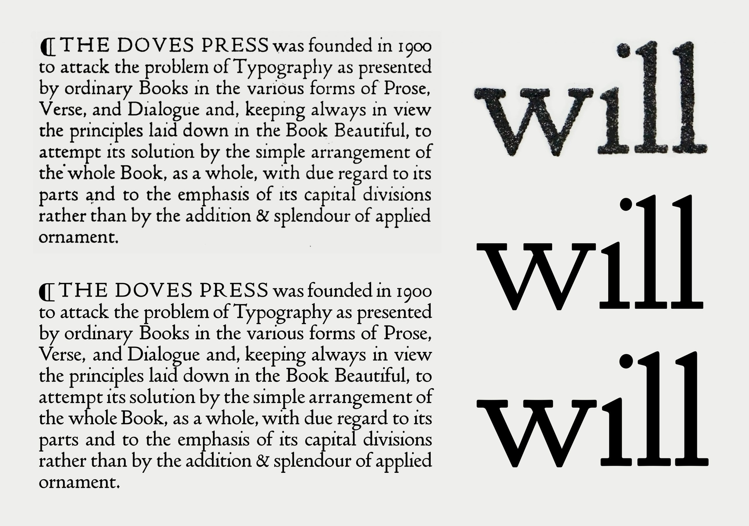
Spacing and kerning have also been updated. Again, this was taken from letterpress sources, except where its quirks are no longer acceptable. Large gaps of negative space between pairs like T–o, W–e and A–V were tightened up.
There are 525 glyphs in Doves Text and 520 in Doves Headline. The Text font contains two versions of the lowercase y, the original plus a newly redesigned iteration. Emery Walker famously disliked the lowercase y’s ‘aggressive’ appearance. In 1923, Monotype chief advisor Stanley Morison reported that Walker wanted to have it recut, intending to print with the Doves type once again if he successfully sued his former partner’s widow, Annie Cobden-Sanderson, for his share of the fount. The original y does add a distinctive, spikey Doves look to sizeable amounts of smaller copy, but it appears rather uncomfortable on a single line of large type. I felt its inclusion was unnecessary in the Headline font, which contains only the redesigned letterform.
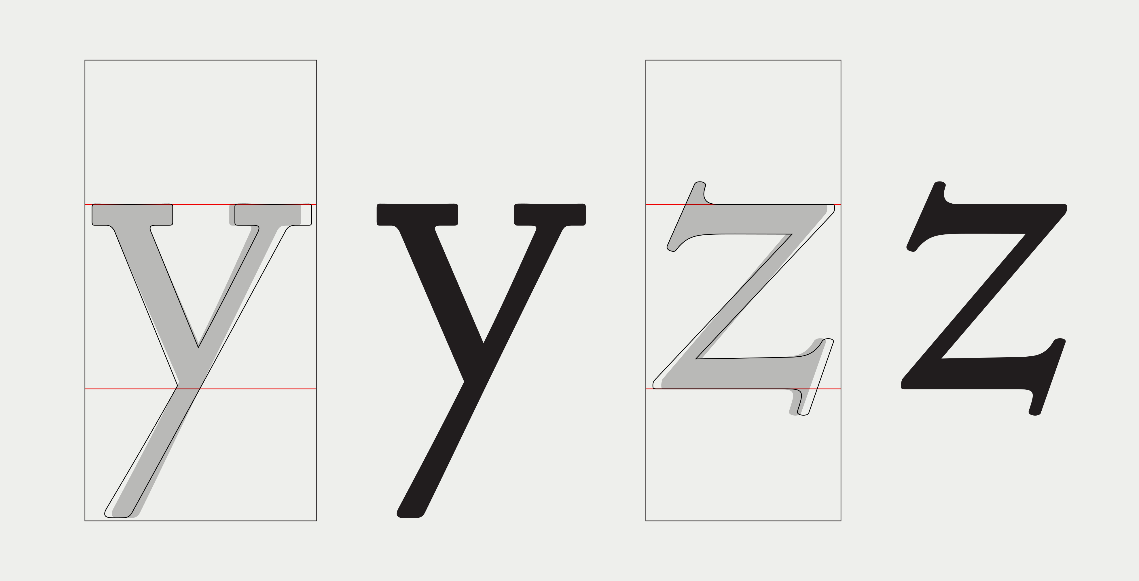
The same goes for both the upper- and lowercase Zs, which have slightly exaggerated proportions. The original shapes were retained in the character set of the Text font, and as before, narrower versions were included as alternatives. Again, the Headline font contains only the newly reconfigured Zs.
I also spent time analysing the metal type to ensure body alignment is authentic, overlaying tests on a scanned Doves Bible page to precisely marry up digital baselines with those in text blocks of the original type. The new fonts are now the same size and line height as the letterpress Doves type when set solid at 15.45 pt.
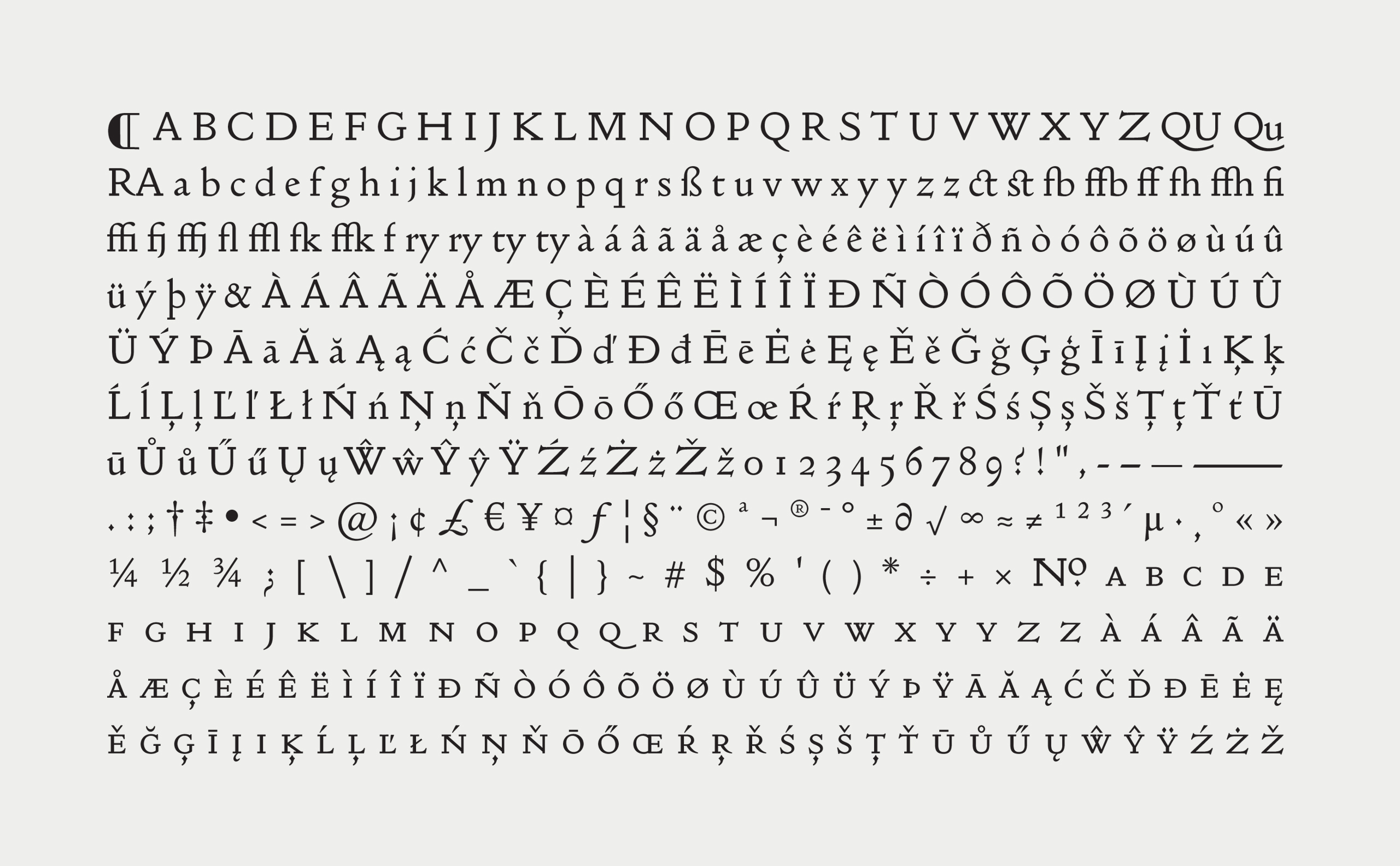
Finally, there are additional small caps, ligatures, signs and symbols. Language support is extensive, with 10 Latin groups covered. The proportions of diacritics have also been dialled down in many cases, the originals being a bit cumbersome. Apart from these few small aesthetic changes and numerous additions adding functionality to the font, I have attempted to be as faithful as possible to the true shapes of the type.
Robert Green, 14 April 2022.
Buy a Doves Type Licence >>
Photo credits:
Original sorts recovered from The Thames: Sam Armstrong
Main banner image: William Matthews-Ellis (Mudlarking)