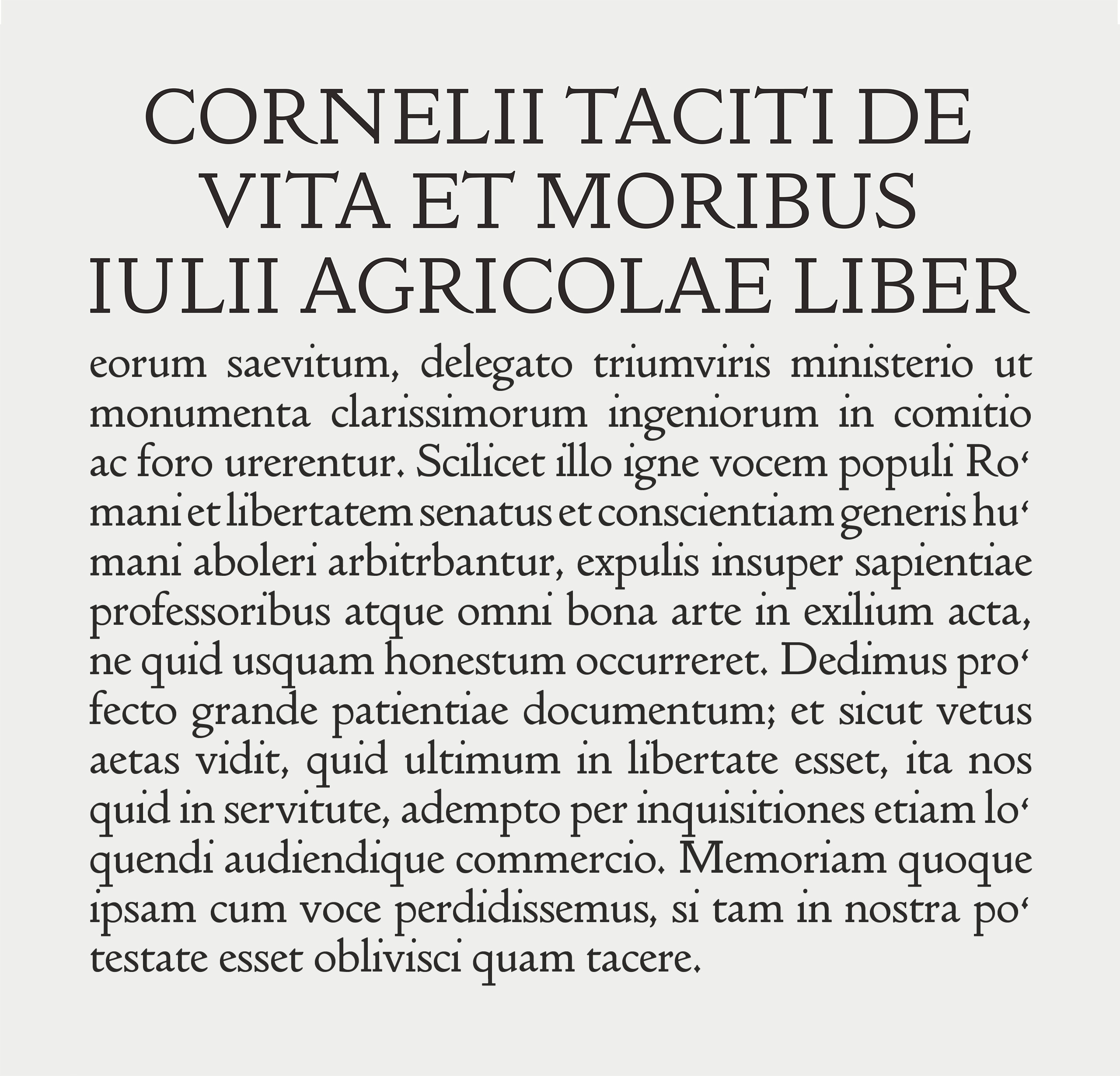
Doves Type Headline was designed for larger applications such as titles, headings, and sub-headings. It evolved due to practical considerations arising from work on the Thames Tideway project. It is lighter and sharper that the Text font, recommended for sizes above 20 pt, for use as an optically adjusted cut of the Doves Type.
Read more about the development of the new Doves Type Text & Headline fonts in Robert Green’s blog article.
Go to the main Doves Type page to see more images, road-test and buy the font.

