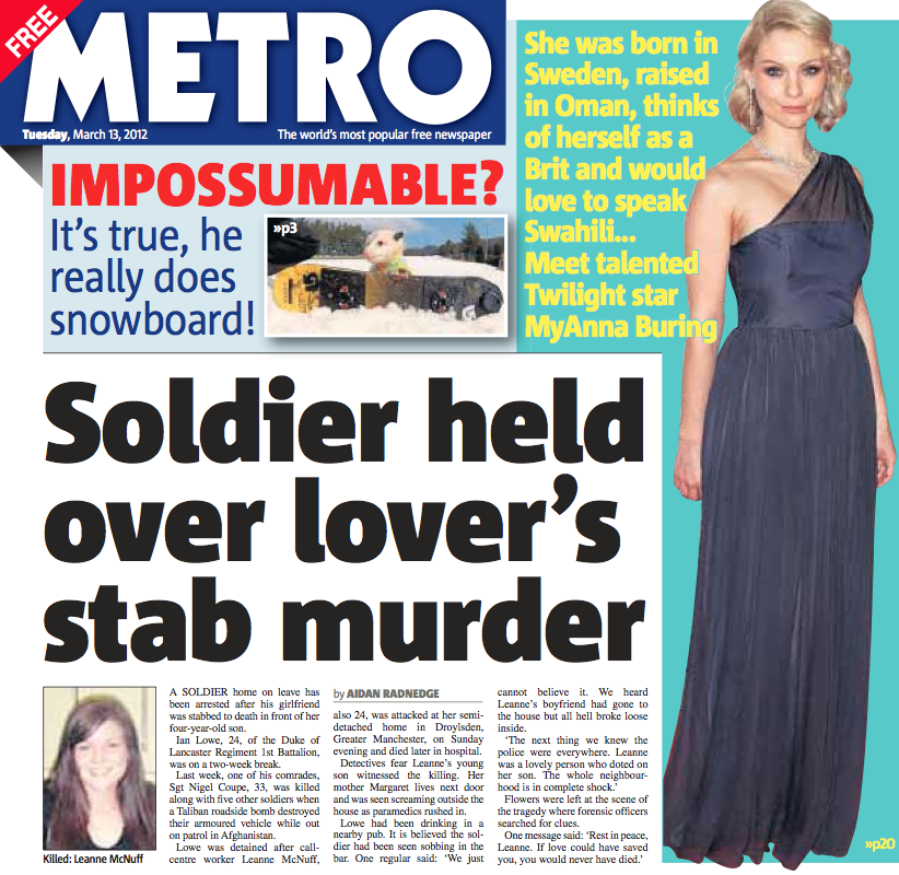
Metro Newspaper
The “world’s most popular free newspaper” instigated a design overhaul in December 2011 with typographic research and consultancy from Typespec.
More than 1.3 million copies of Metro are distributed across 50 UK cities each weekday, making it the world’s largest free paper and the third biggest in the UK. The paper features a mix of national and international news wrapped around local information – entertainment previews, listings, weather and travel.
The brief was to refresh the look and feel by replacing the principal typeface, Font Bureau’s Amplitude, with an extensive, legible and versatile font family which would work equally well at 6pt in the TV listings as it would for large front page splash headlines and prominent subheads.
The excellent Corpid typeface by Lucas de Groot was ultimately chosen from the final shortlist submitted by Typespec, in part due to the range of weights and widths it offers but also the tight newspaper friendly spacing and short descenders which benefits both copyfitting and word count.
Corpid reads very well both in print and on digital devices giving Metro a modern workhorse sans serif that works across all media.
Group Art Director Christopher Cherry was pleased with the end result:
“When I asked Typespec to find a new font family for the redesign of the Metro Newspaper, I knew we had to find an attractive, newsy but easy to read font. Typespec presented an edited list, set in different headline styles, of around 10 options. We ended up choosing Corpid, which with its wide range of weights slotted in really well. In a world of literally thousands of fonts presented on some rather wobbly websites working with a company like Typespec is a pleasure. They’re always on the end of the phone with sensible and constructive font design solutions, have an unprecedented knowledge of fonts and how they’re applied to different design environments.”
Client: DMG Media
