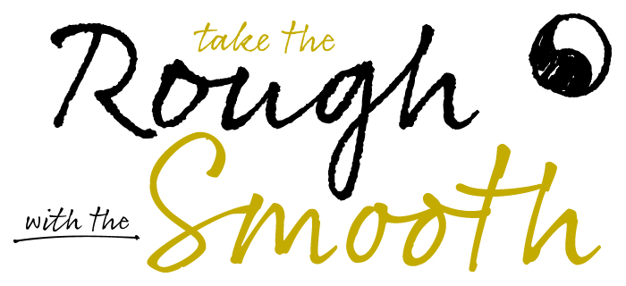
New Rollerscript type family raises the bar for handwriting fonts.
Type designer Nick Cooke has released an ingenious new handwriting font family called Rollerscript via his G-Type foundry. Available in 2 styles, Rough & Smooth, it’s the perfect solution if, like me, your handwriting has gone to the dogs and you’re searching for the most realistic digital replacement.
As the name suggests, the typefaces were created from Cooke’s own handwriting with a Pentel rollerball. Rollerscript is more casual and informal than sister font Olicana (created using steel nib and ink) but just as realistic. Like Olicana, the authentic free-flowing handwritten style is achieved through a combination of ligatures and contextual alternates which kick in automatically as you type (as long as you’re using OpenType savvy software that supports ligatures, e.g. InDesign, Illustrator or Quark XPress).
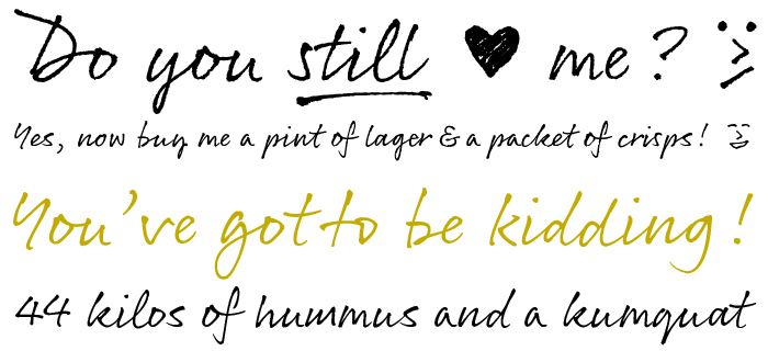
Double letter combinations like gg, tt, ll, oo etc are dead giveaways in standard handwriting fonts, but not here. An extensive range of ligatures and stylistic extras, combined with some nifty OpenType programming, produces the natural style most other digital faces lack.
The end result is as near as you get to true handwriting, packed with personality.
The fonts are fully equipped with multiple figure sets, small caps, Central European languages and other OpenType features. In addition there is also a set of useful underlines in 10 widths for adding extra emphasis, plus a range of dingbats and emoticons which will bring humour and personality to documents, menus, invitations, blog posts etc.
Due to some nasty client modifications to the letters ‘r’ and ‘z’ in Cooke’s previous handwriting fonts Olicana and Gizmo he decided to swap things around this time. The cursive ‘r’ & ‘z’ are placed as alternates, thus making the ‘standard’ letters the default style and providing users with a real choice.
See more samples, test drive and buy the font on the G-Type website.


