
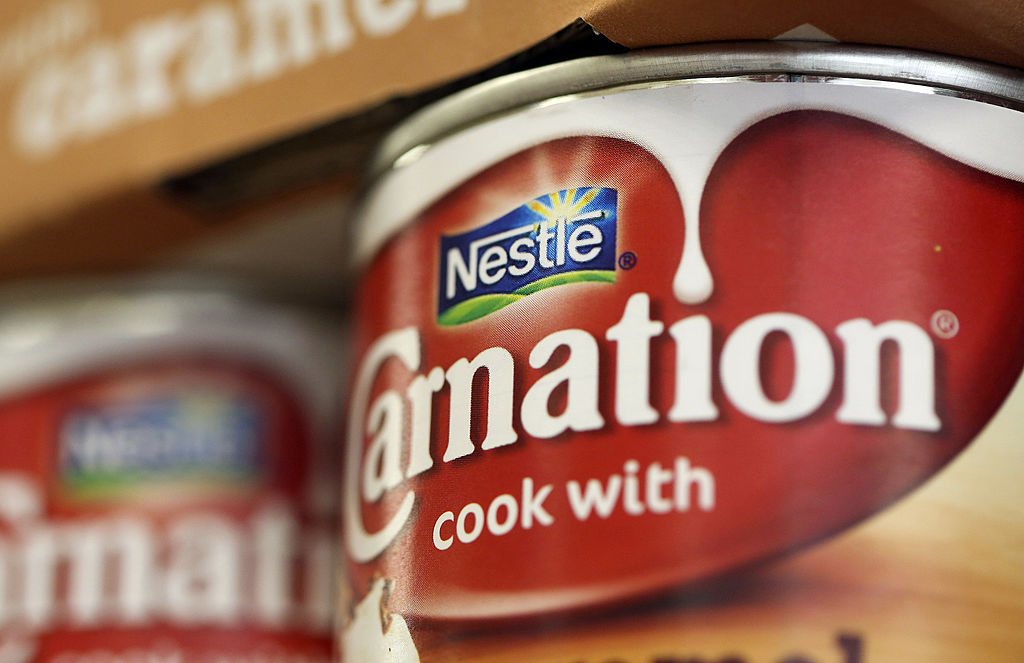
Carnation
Custom font development for Nestle’s Carnation brand.
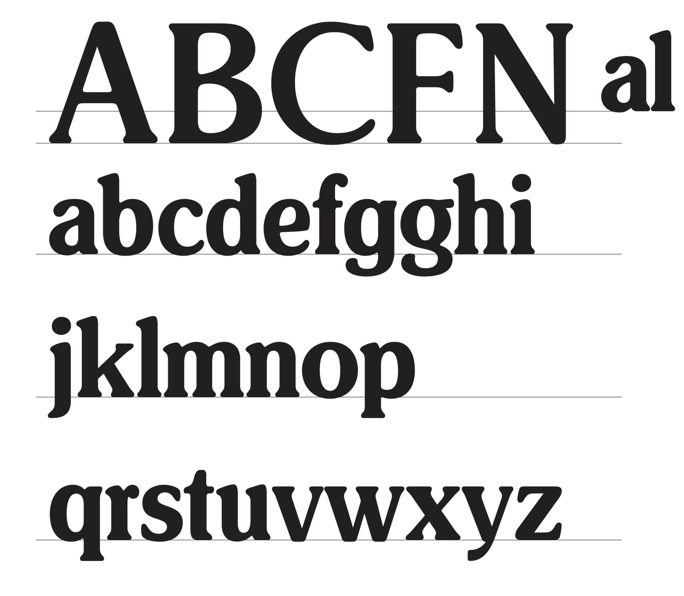
A full lower case alphabet (including an alternate g) was created based on the established letterforms in the Carnation logotype, with the addition of 5 capital letters.
The type was featured in a series of idents for the Food Network with the aim of showing that there is a lot more to Carnation than people might think.
Client: Nestle
Agency: Publicis