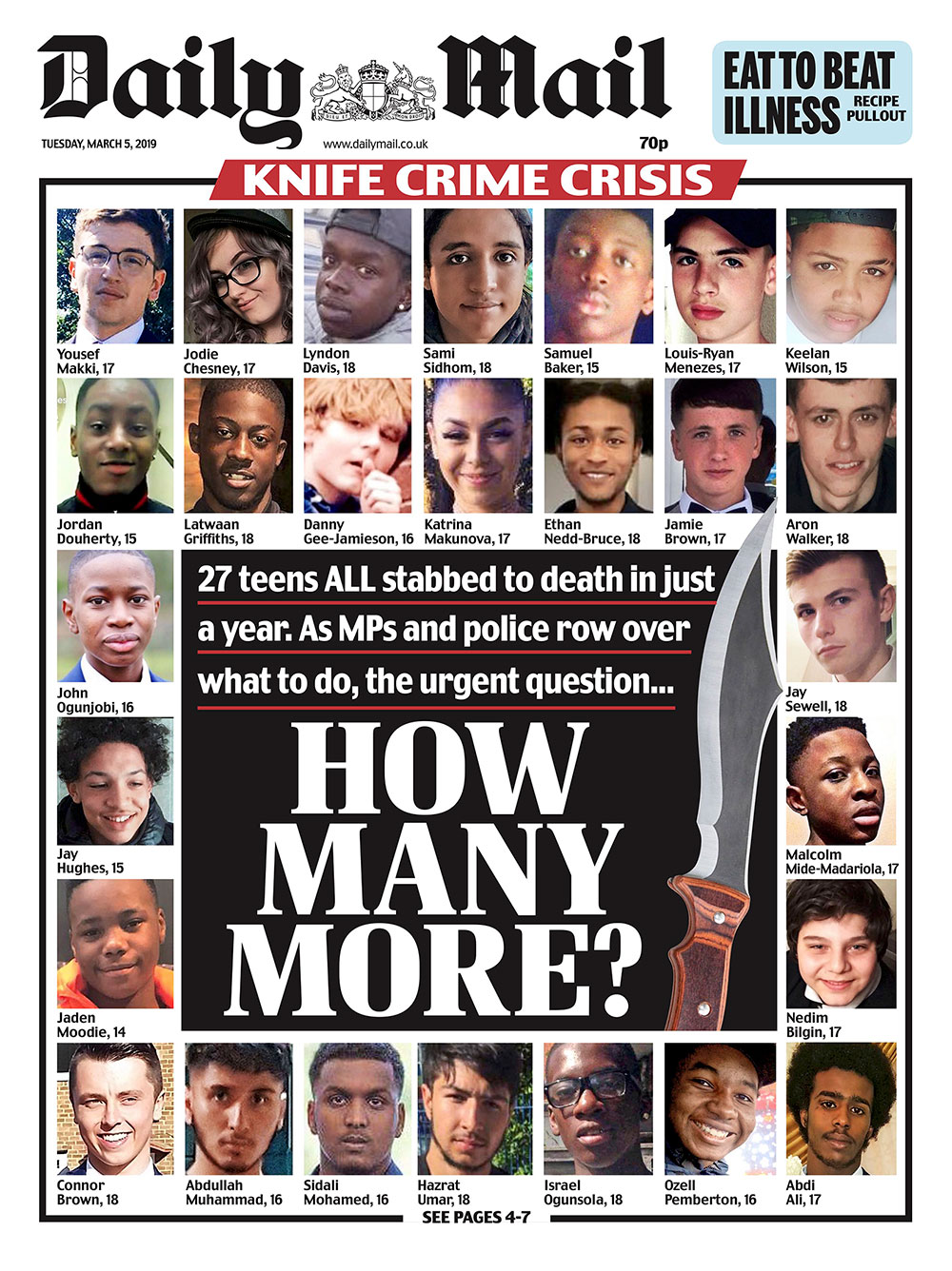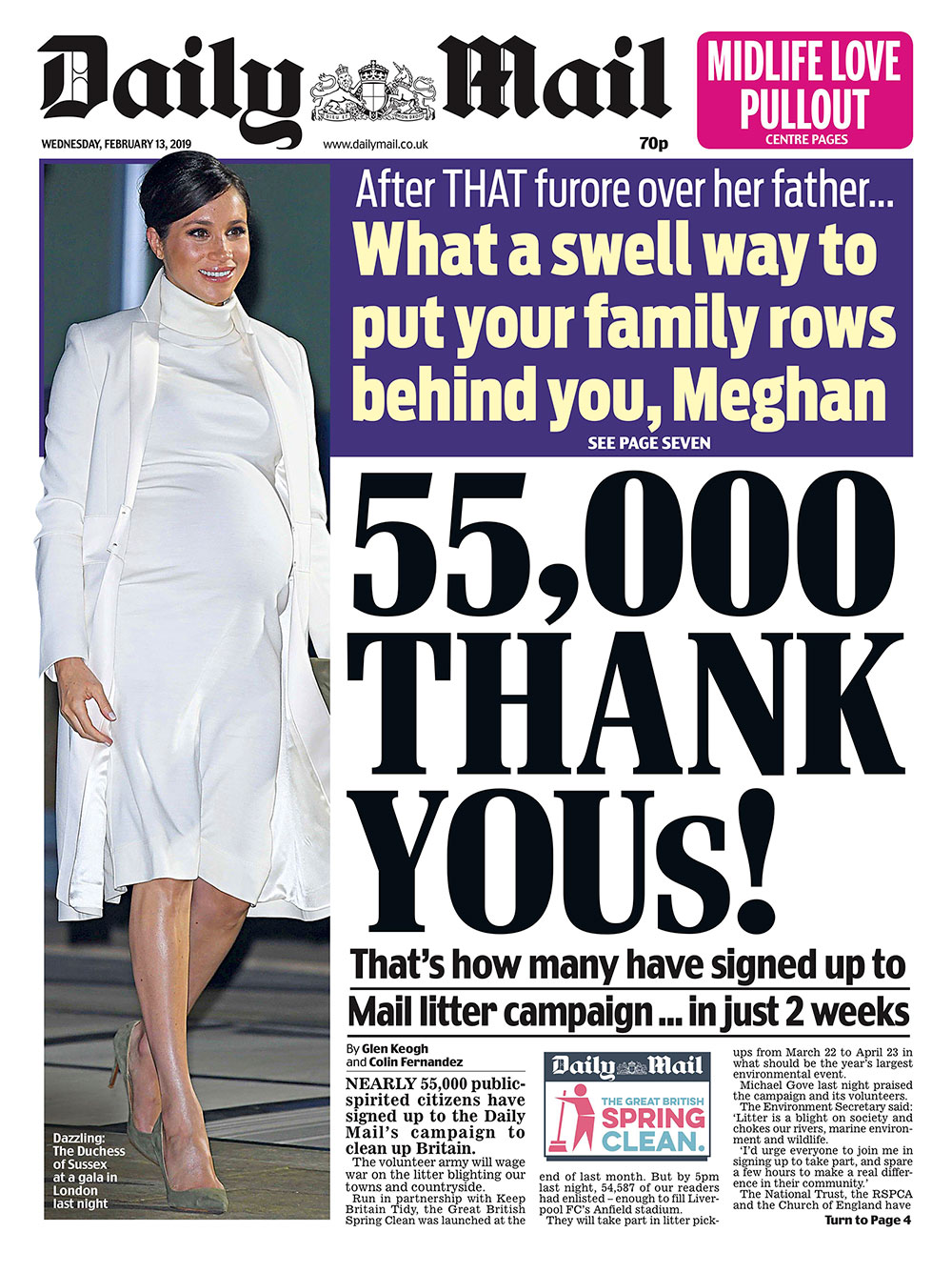
Daily Mail Masthead
Typespec were commissioned by The Daily Mail to overhaul their masthead and crest prior to rolling out digital editions of the paper.
The previous crest artwork created for the print edition back in the 1990’s had been poorly constructed and needed a major revamp to improve the design and definition. The lion and unicorn needed sustenance and the jokey demeanour had to go!
The original type was in pretty poor shape too, lacking harmony. Letterforms were subsequently redrawn with even x-heights, improved stems and smoother curves.
The end result is a much more professional, authoritative mark that stands up well across all media. The new masthead now features on the printed newspaper as well as digital editions and all marketing collateral.


Client: DMG Media
