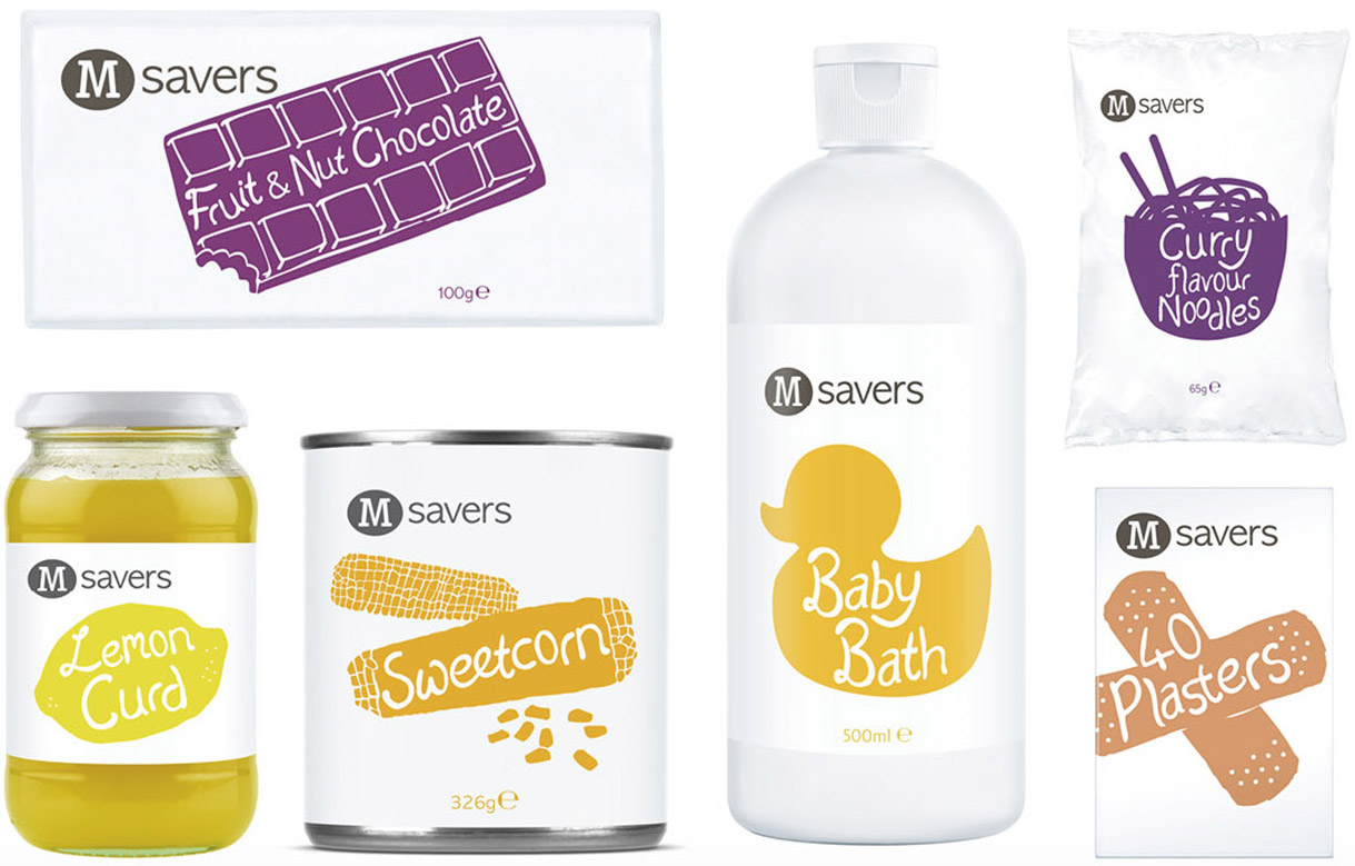
Morrisons Savers
Typespec produced a bespoke typeface for use on over 17,000 products in the M Savers range, Morrisons’ entry level ‘value’ brand.
The M Savers letterforms were designed by senior CPB creative Craig Barnes. Typespec crafted matching punctuation and extended the character set to include full West European accents, ordinals and currency symbols before kerning, spacing and generating the new custom font in OpenType format.
Coupled with eye-catching hand-drawn illustrations the quirky type style injected real personality into the brand that engaged shoppers and made the entire product range a more attractive proposition. The bright and colourful packaging helped to dilute the stigma certain buyers traditionally associate with ‘basic’ or ‘value’ branded items.
A key component of the M Savers custom font is the programmed feature which automatically replaced certain double character combinations (gg, tt, rr etc) with special ligatures drawn by Typespec; this increased the handwritten authenticity and charm of the lettering. The playfulness of the typeface was further accentuated by irregular positioning of glyphs in relation to the baseline.
Client: Morrisons
Agency: Coley Porter Bell
Image courtesy of CPB

