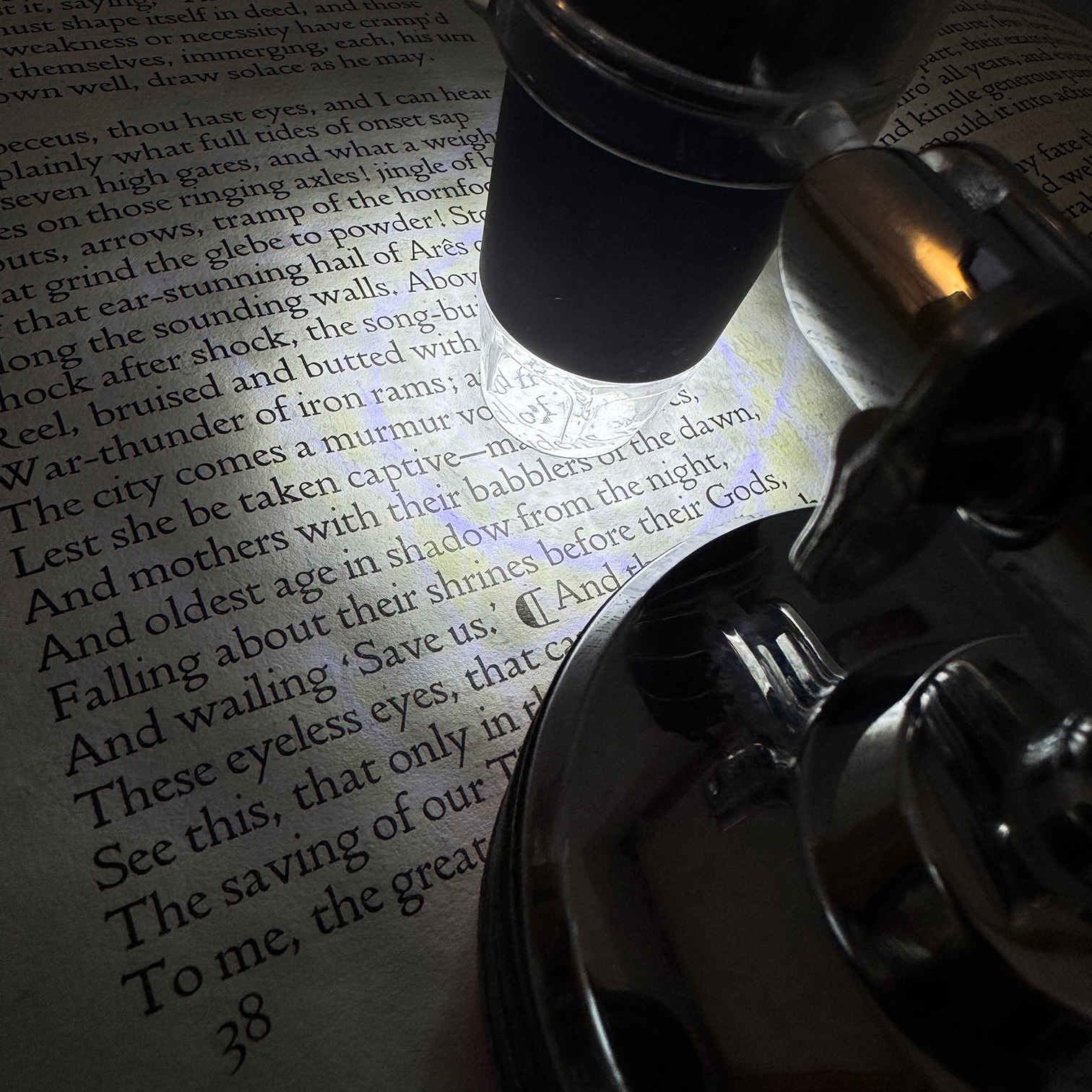
Robert Green explains the background to the new version 5 of The Doves Type, released in September 2026.
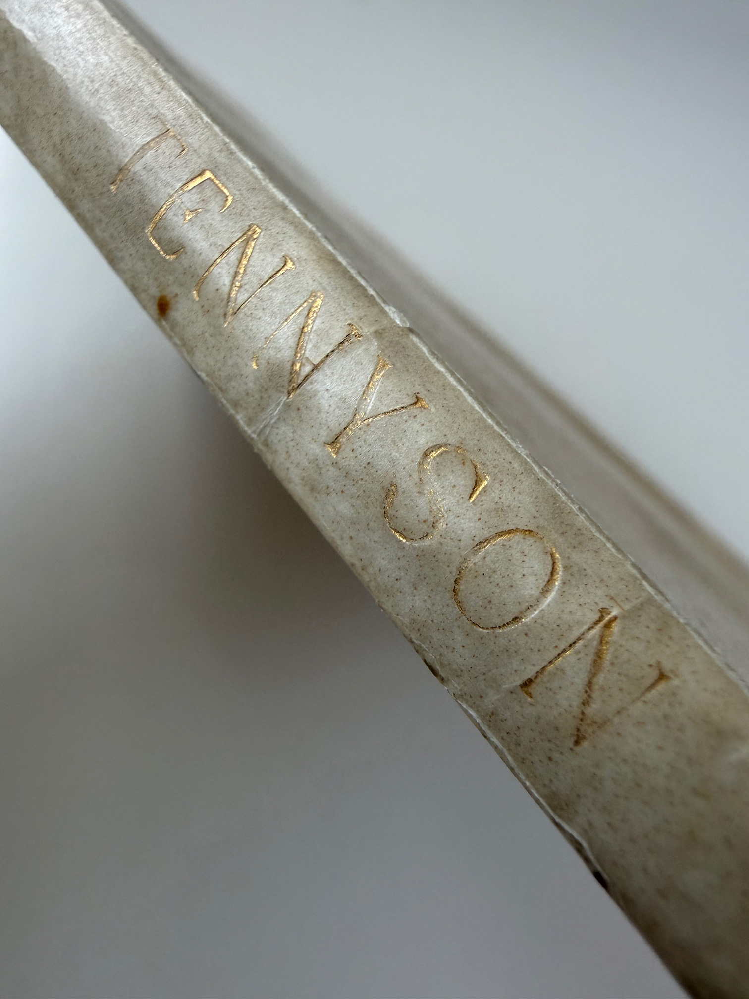
Version 5 is intended to represent the original Doves type in its ideal printed state, or at least as close as possible in a digital interpretation. Revisions were based on printed type from Alfred, Lord Tennyson, Seven Poems and Two Translations, the fourth book issued by the Doves Press (DP4).
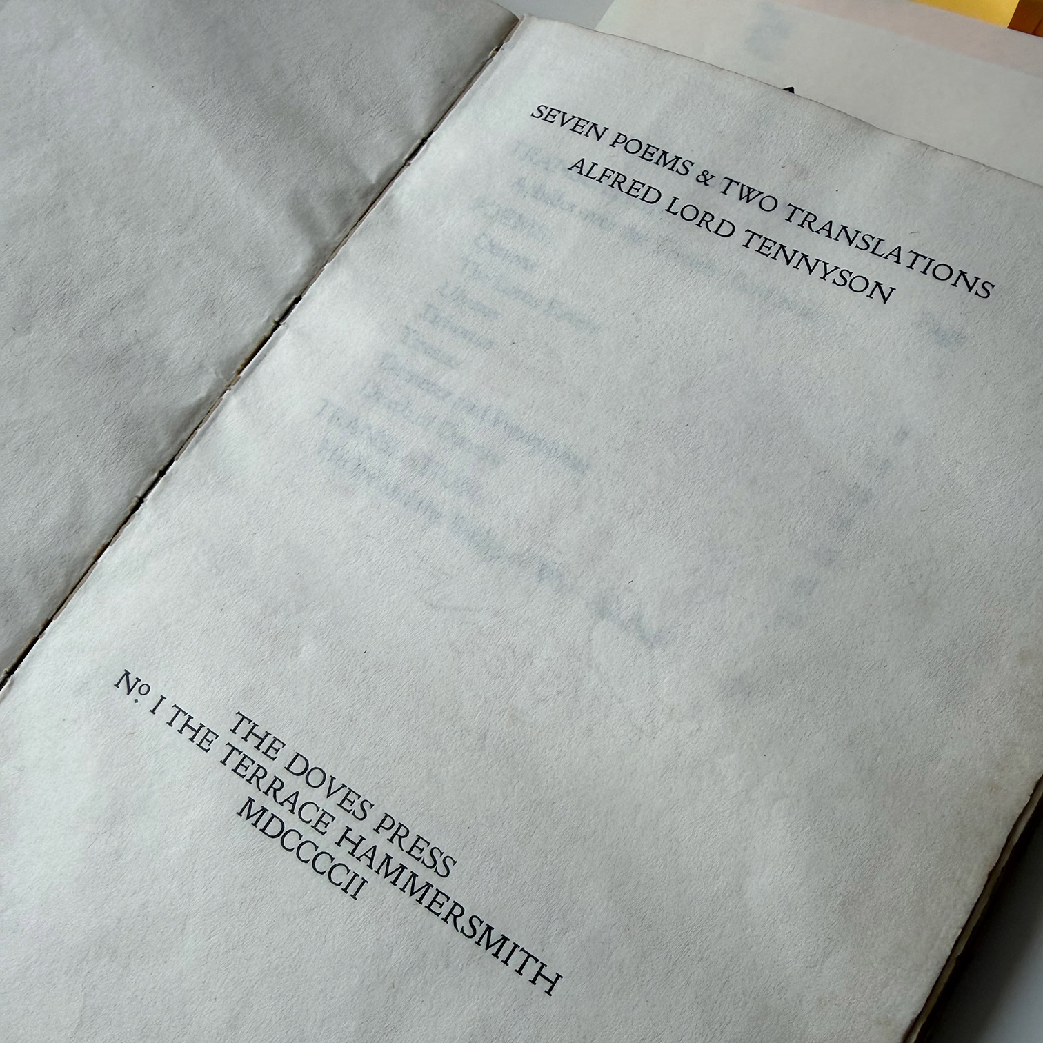
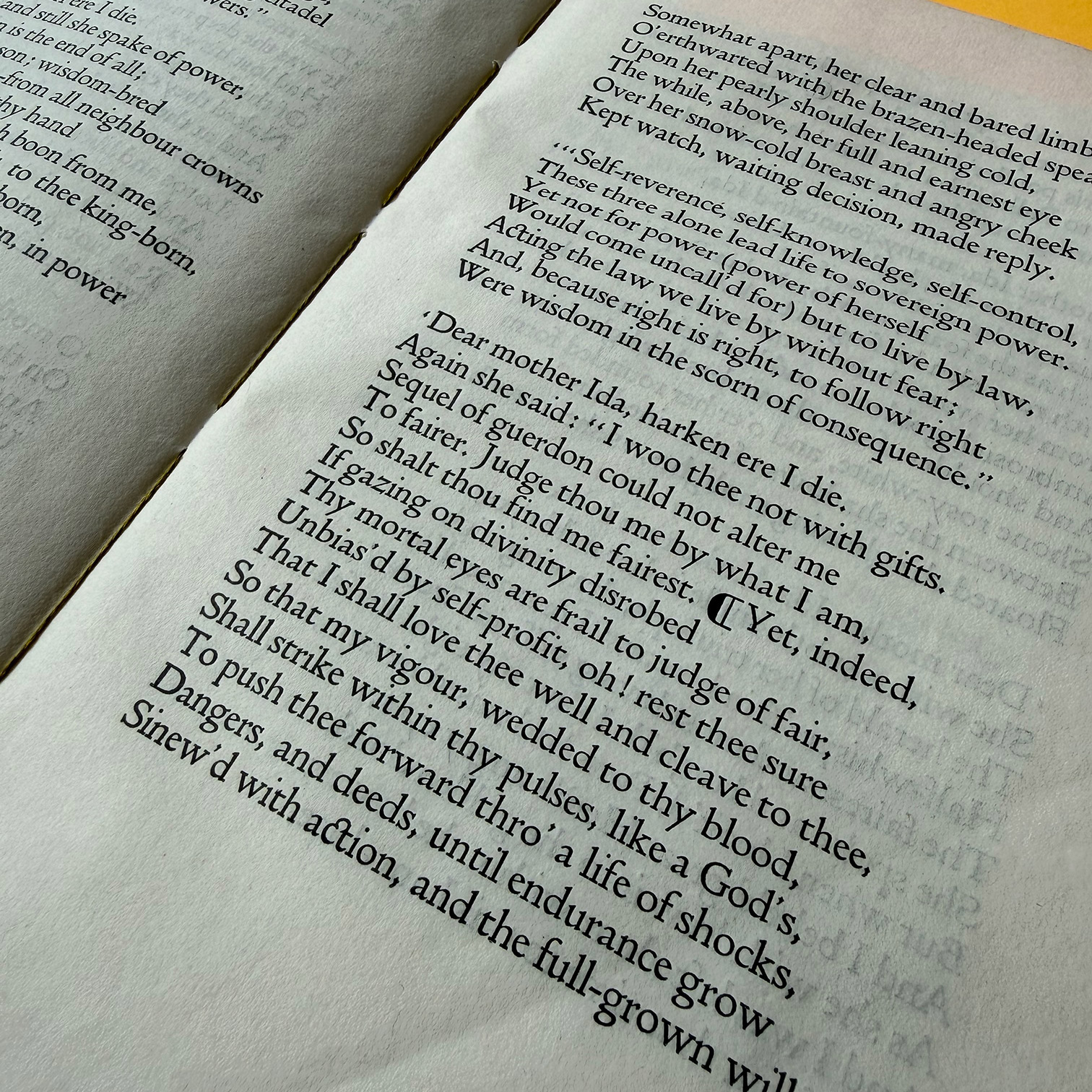
When Tennyson was printed in 1902, the bulk of the fount had been delivered to the Doves Press; however, much of it was yet to be used. Consequently, the type in Tennyson is clearly defined, especially its finer details, which in later books increasingly exhibit wear and distortion.
Multiple examples of each letter, number, and symbol were captured with a microscope camera at 1000x magnification. The outlines and proportions of several examples of each glyph were compared, and where possible, cross-referenced with corresponding sorts from the recovered metal fount.
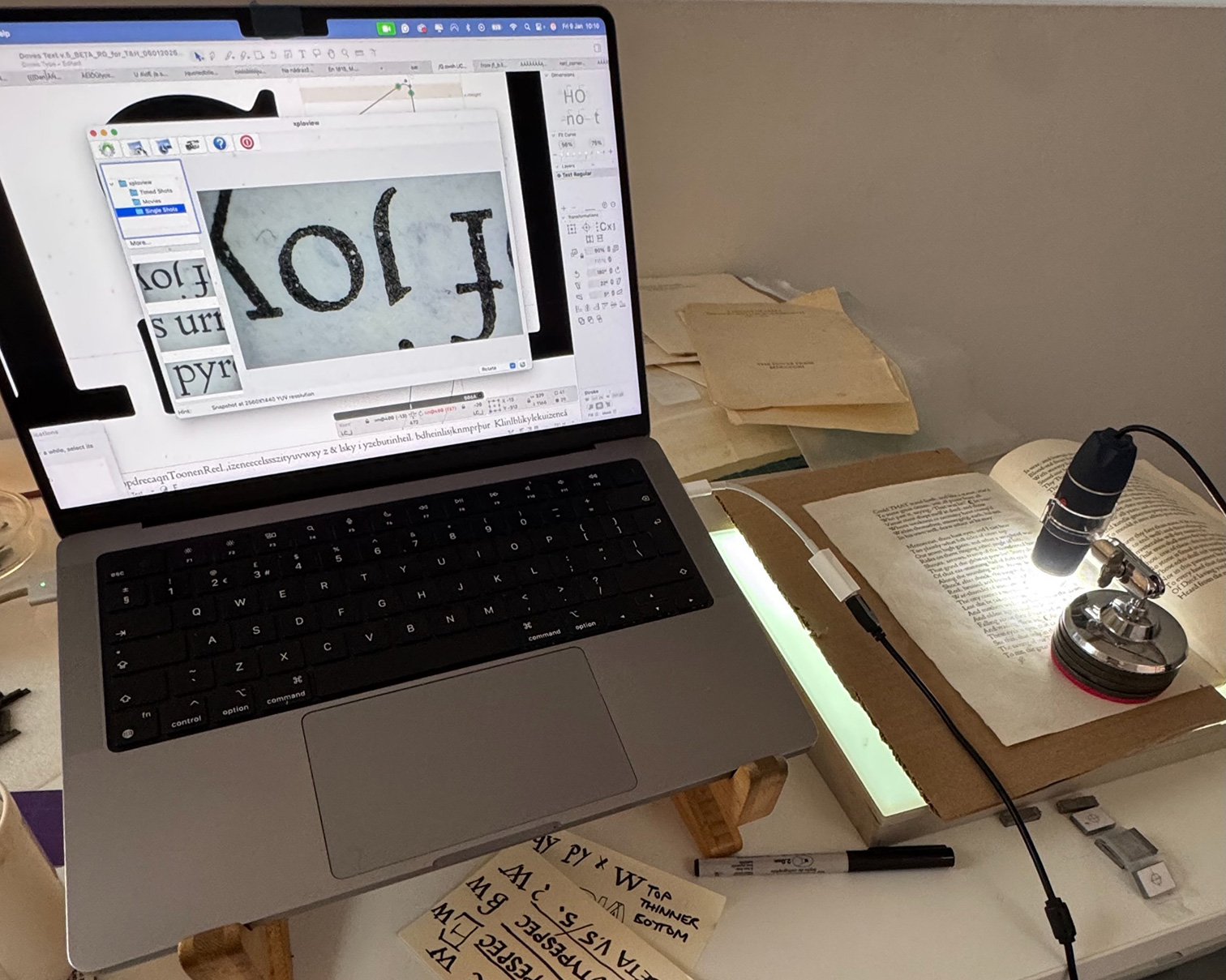
Images of healthy (well-printed) impressions captured from Tennyson show how precisely the punchcutter, Edward Prince, engraved delicate features such as serifs, beaks, and spurs.
The uniformity of these details is not apparent in later sources, where deterioration is evident from their unevenness. These and other small features were amended, giving Version 5 a neater overall appearance than earlier iterations.
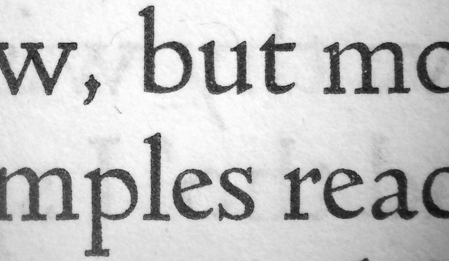
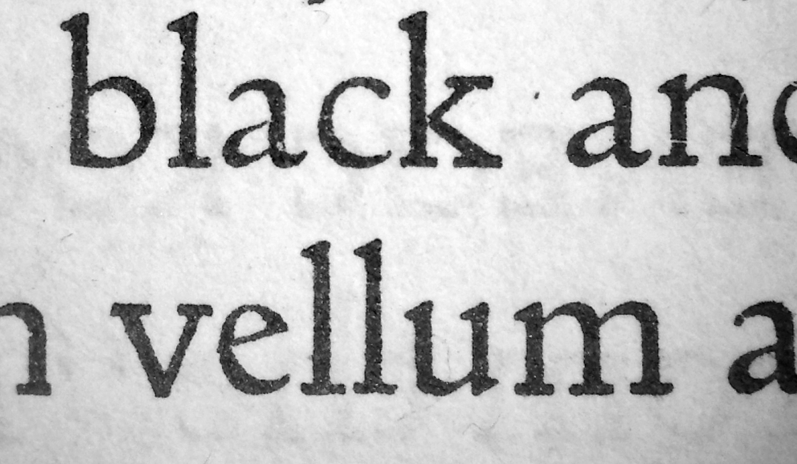
Note the worn type in an example from 1915 (above, right). Serif shapes are ambiguous compared to those in Tennyson, 1902 (left). Eighteenth-century typefounder Pierre Simon Fournier described the usual fate of worn-down type in Manuel typographique: ‘(Type) always keeps its depth of counter with the exception of a slight decrease of about the thickness of paper, which comes of the wearing down of the parts in relief, which, be coming rounded at the edges, lose their proper contour (…) It follows that letters, whether more or less deeply cut, become worn out and are returned to the metal-pot …’ (From Carter’s translation, 1973: p. 33).
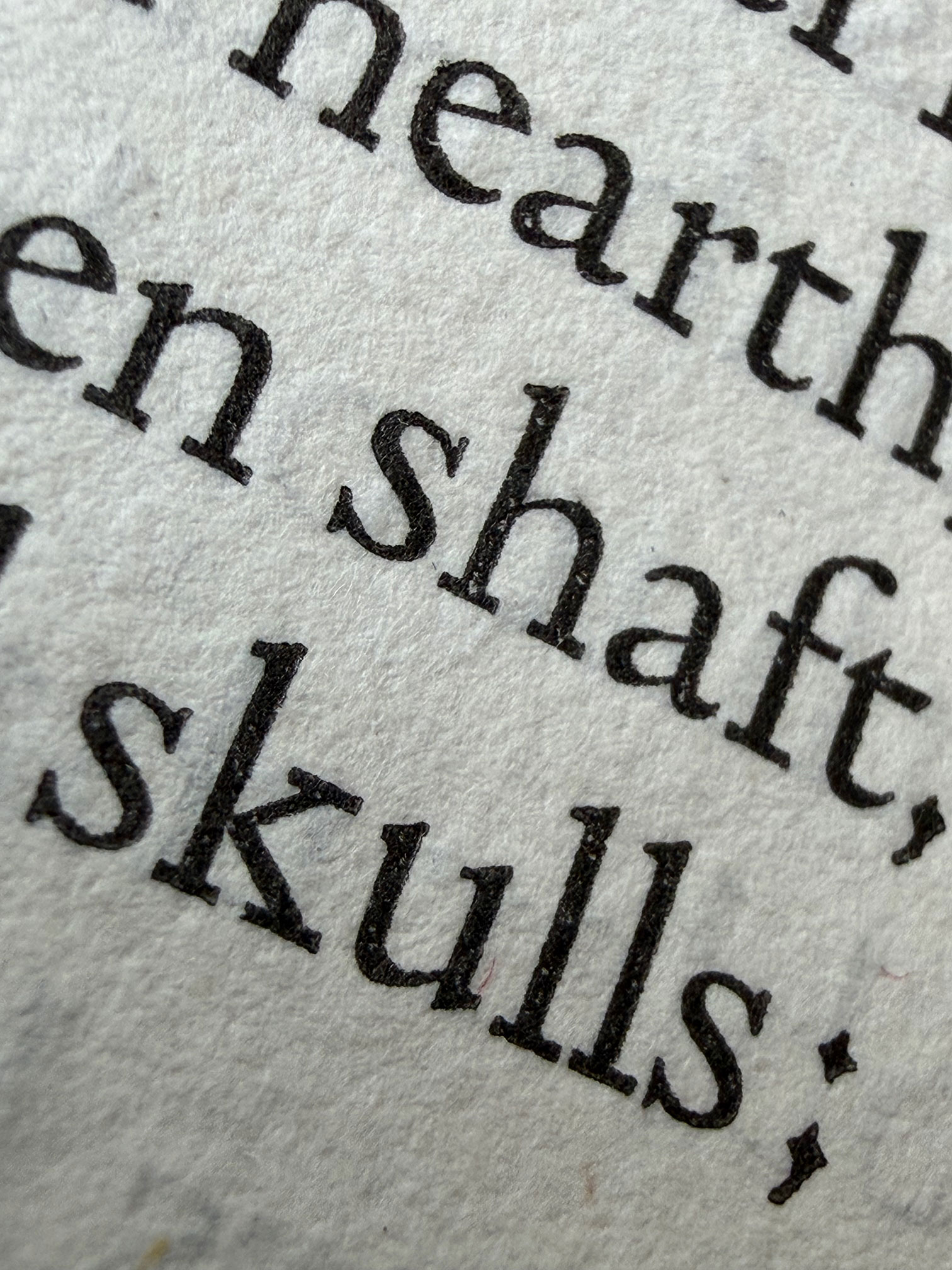
Diacritics were also revised based on newly sourced references from the Doves edition of John Milton, Paradise Regain’d (DP7; 1905), eliminating some earlier guesswork. Paradise Regain’d contains all but one of the original suite of accented sorts, many of which had not been printed previously.
Additionally, glyphs introduced in earlier versions to extend the character set of the original Doves fount were extensively redesigned.
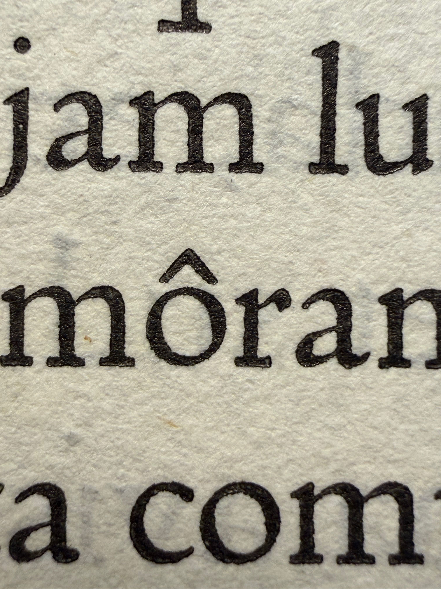
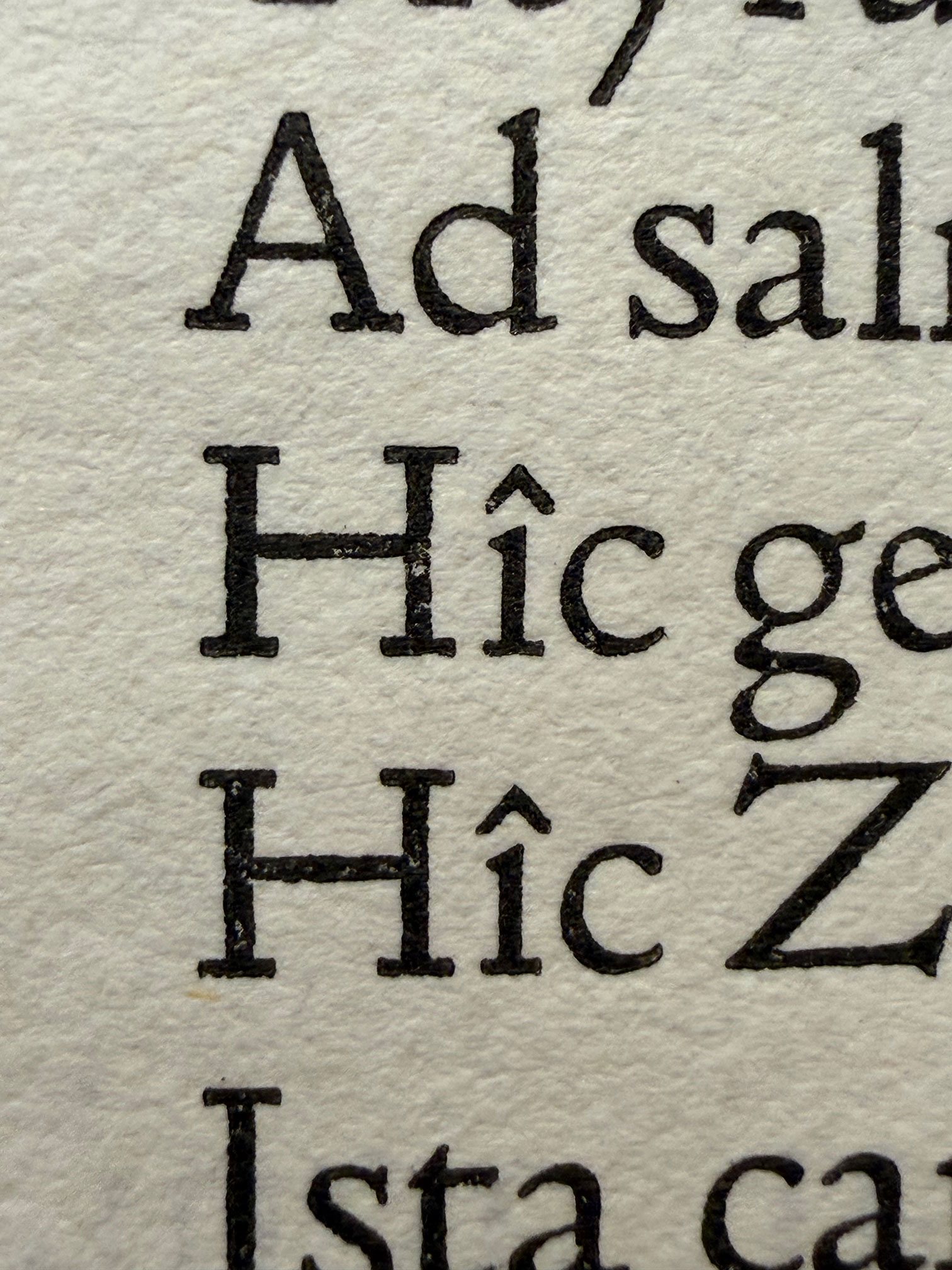
Finally, proportions and letter spacing were refined, and the glyph-to-body ratio was recalculated by comparing the dimensions of recovered metal sorts with line depths in printed Doves materials.†
Robert Green
Source: Marianne Tidcombe (2002). The Doves Press. London/Newcastle, DE: The British Library/Oak Knoll.
† The Doves type was set solid, i.e. without leading (lead spacing between lines of type). Therefore, the type body equalled the depth of each line. See Proctor (1903) An Index of Early Printed Books in the British Museum.