Blog

The Grand Organ Project
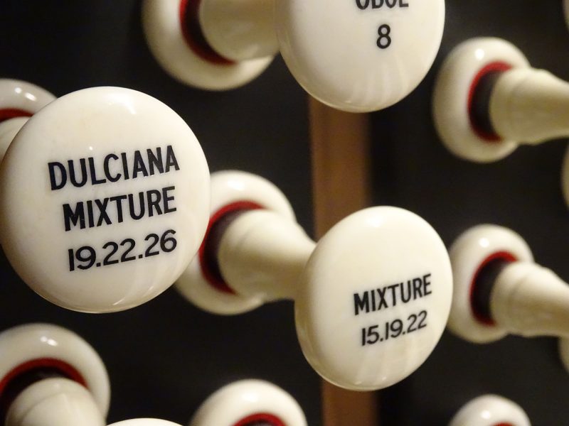
It’s always gratifying to see custom fonts we’ve created being deployed in the wild, and doubly so when the location is as prestigious as York Minster. Typespec were commissioned in 2019 by specialist organ manufacturers Harrison & Harrison Ltd to develop a brand new custom typeface for use on all their future builds, starting with [...]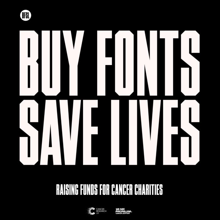
New BFSL website
Pentagram partner Matt Willey has designed a brand new website for BuyFontsSaveLives (BFSL), the charity venture founded by Paul Harpin and curated by Typespec. Not only does the site include reworked versions of the popular MFred & Timmons NY fonts, but Matt has also kindly donated a further five type families to boost the campaign [...]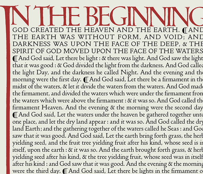
History of the Doves Type®
History of the Doves Type Thomas James Cobden-Sanderson along with partner, photographer and engraver Emery Walker, established the Doves Press in 1900 by the banks of the River Thames in Hammersmith, London. Cobden-Sanderson’s stated intention for the Press was, ‘to attack the problems of Typography’. Preparations for the new venture had begun the previous year, [...]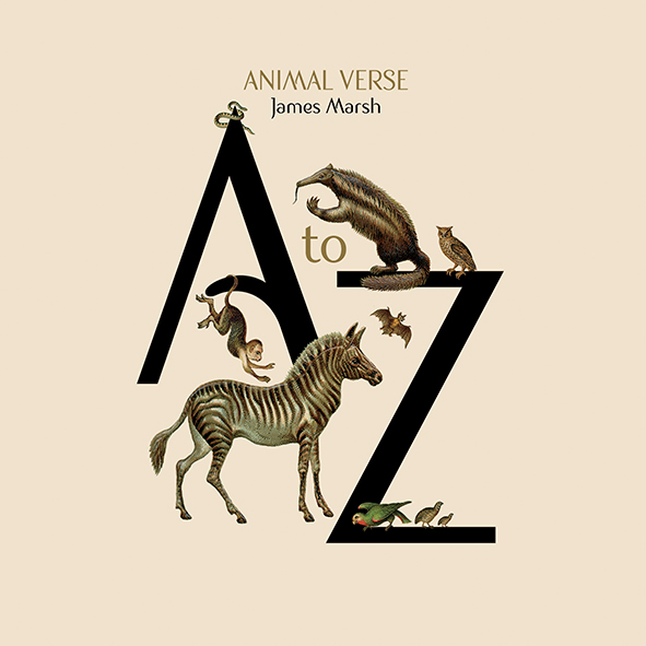
ArtyType Specimen Book
Internationally renowned designer and illustrator James Marsh has published a limited edition specimen book for his Sanzibar Pro typeface featuring 26 self penned animal verses, one for each letter of the alphabet. Designed in the style of a children’s book with adapted illustrations sourced from an ultra-rare 17th Century scrapbook, it reflects the symbiotic nature between … Read More
Recovering The Doves Type®
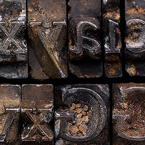
BBC journalist Tom Beal's background piece and interview with Robert after the discovery was announced. Rewind 4 months, to the first three pieces found by Robert Green, lower case v, i & e, discovered after only 20 minutes at low tide under Hammersmith bridge in October 2014. They had probably moved no more than 10 [...]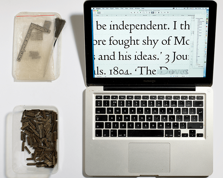
The Doves Type® revival
Raised from the dead:The Doves Type story. The Doves Type legend is one of the most enduring in typographic history and probably the most infamous. It’s the story of a typeface and a bitter feud between the two partners of Hammersmith’s celebrated Doves Press, Thomas James Cobden-Sanderson and Emery Walker, leading to the protracted disposal [...]
Futura Gold animation
Futura comes to life in superb animation by Chris Gavin. I’ve never been a huge fan of Paul Renner’s iconic typeface but I’m not letting that get in the way of my admiration for Chris Gavin’s sparkling new work, the animated adventure mini-series “Futura Gold”, in which Chris uses glyphs from the font for every … Read More
Type Matters!
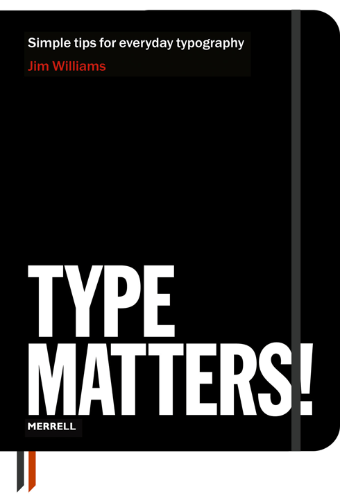
Joe Graham reviews Jim William’s book, published by Merrell. What a cover! Publishers Merrell please take a bow for committing to such a stylish and lusciously soft black leather flexi binding with moleskinesque ribbon placeholders and elastic closure. This is tantamount to pure typographic titillation as you caress the embossed reversed type and … Read More

Rollerscript fonts: more genius from G-Type
New Rollerscript type family raises the bar for handwriting fonts. Type designer Nick Cooke has released an ingenious new handwriting font family called Rollerscript via his G-Type foundry. Available in 2 styles, Rough & Smooth, it’s the perfect solution if, like me, your handwriting has gone to the dogs and you’re searching for the most … Read More
